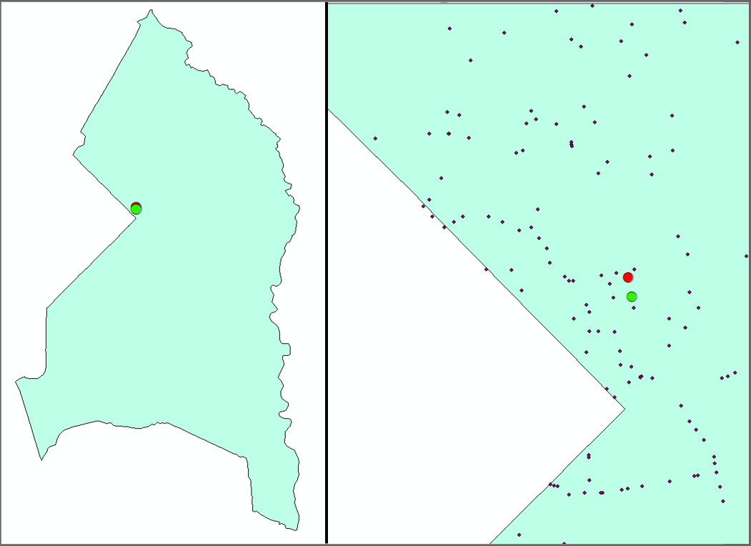
Figure 1a. Mean accidents (Red) and Weighted Mean Accidents (Green). The left picture is displayed with filtered_CarAcc.shp turned off for better visibility of the calculated points.
Generally speaking, spatial pattern analysis focuses on describing observed patterns in data across space. This type of analysis also tests whether an observed pattern can be confirmed or rejected from an expected null hypothesis. The point data analysis labs cover spatial pattern methods including central tendency, dispersion, clustering, density and spatial autocorrelation. The car accident data used for the point data labs is named filtered_CarAcc.shp which encapsulates the occurrences of car accidents within the borders of Prince George’s County. This shapefile excludes poorly geocoded records with scores less than 60 and a Status attribute of U (Unmatched). Upon first glance of the point layer data, it is apparent that there are clustering behavior occurring mainly on the western border of Prince George’s County. For this lab, the purpose of these spatial pattern analyses is to discover valid statistical descriptions of the car accident data which may not be immediately interpretable through visual deduction.
The first of the spatial pattern methods to be analyzed is central tendency. Among the types of central tendency that were performed for this lab were mean center and weighted mean center. Under Spatial Statistics Tools > Measuring Geographic Distributions > Mean Center, this central tendency produced a new geographically centered point relative to the surrounding car accident data’s distances from it. This calculation provides a new data point rather than using one of the existing points as the new mean center. The parameters used for the mean center include an input feature class which is filtered_CarAcc.shp and an optional weight field that was omitted since this central tendency method only relies of projected data to accurately measure distances. In addition to mean center, the weighted mean center was also calculated for Prince George’s County’s car accident data. The parameters used for this method are similar to the mean center in which the filtered_CarAcc.shp serves as the input feature class; however, the optional weight parameter is now accounted into the calculation. Specifically, the Level attribute of the car accident data was selected for the Weight Field parameter. These two central tendency methods produced geographically-centered points that were located within close proximity of one another. Figure 1a illustrates how these points are also located within the western border of Prince George’s County where clustering behavior is observed. Using ArcMap’s Measure tool, the placement of points for these central tendency methods were measured to be 207.12 m. The weighted mean center was located northwest of the mean center which suggests that car accidents with higher Level attribute values occur along the upper northwestern border of Prince George’s County. The placement of the mean center can also suggest that larger number of car accidents, not account for weights, occurred along the southwestern border.
Figure 1a. Mean accidents (Red) and Weighted Mean Accidents (Green). The left picture is displayed with filtered_CarAcc.shp turned off for better visibility of the calculated points.
Furthermore, the final central tendency method used for the point data analysis lab was the central feature. This method identifies the most geographical central location that contains the shortest total distance to all other features. Specifically, this method determined the car accident that was most centrally located in the input feature data. Unlike mean center and weighted mean center, the central feature does not create a newly calculated point; instead, it actually selects a single car accident feature that already exists and use it to represent the central feature. The central feature accepts an Input Feature Class and a Weight Field, similar to the previous central tendency methods, but a Distance Method parameter which specifies how the distances from each point are calculated. Two central features were calculated with the Distance Method being set to Euclidean distance and Manhattan distance, respectively. Figure 2a also illustrates the how the newly selected central features differ when calculating central tendency with differing distance methods. These two central features were measured to be 1508.7 m from one another which confirms the importance of choosing a suitable distance method since it has the potential to return various features.
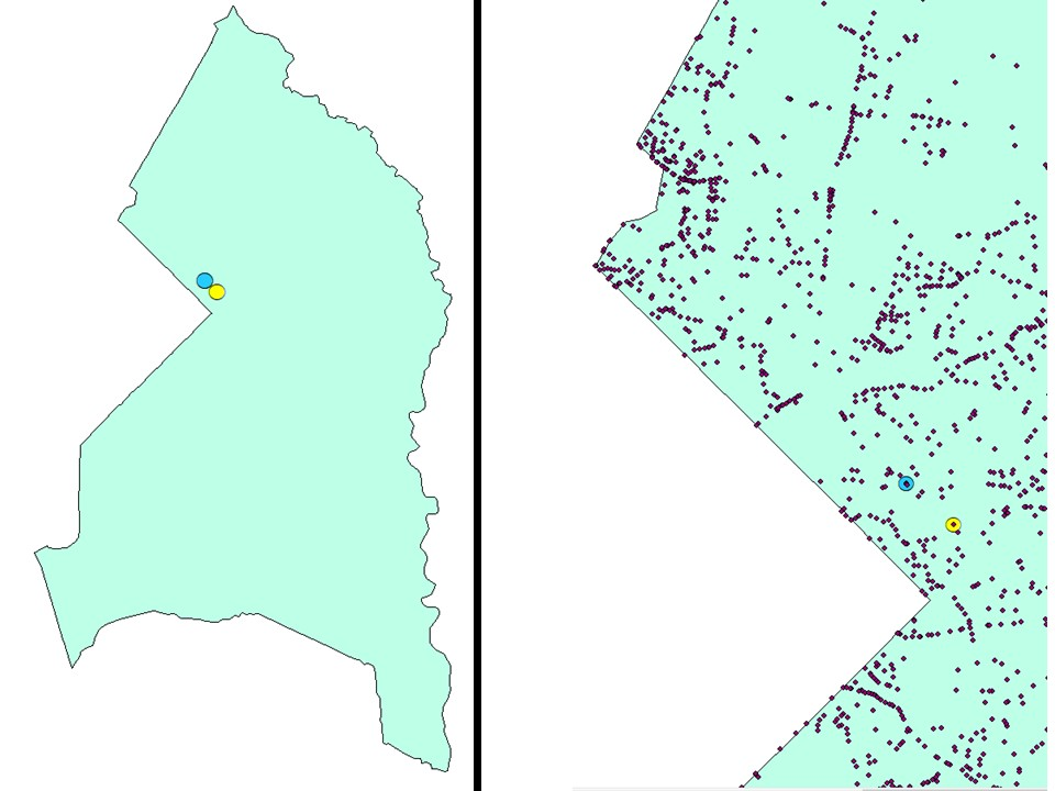
Figure 2a. Euclidean central feature (Yellow) and Manhattan central feature (Blue). The left picture is displayed with filtered_CarAcc.shp turned off for better visibility the calculated points.
In addition to analyzing central tendency, the spatial dispersion of the car accident data also yields very important insights. Particularly, the car accident data was calculated and determined whether or not it follows a perfectly dispersed pattern. The procedure for determining this pattern of spatial dispersion also included the use of a goodness-of-fit test which was the chi squared method. The quadrat count analysis was used to measure the density of the points. Poorly geocoded features that contained X and Y attribute values of zero were filtered from the data using a SQL selection query. The selected features were exported to a new file where 7,643 properly geocoded car accidents can now be observed. The size of the quadrats was to be properly calculated in order to yield accurate results. Using ArcToolbox > Cartography Tools > Data Driven Pages > Grid Index Features on PrinceGeorgesCounty_Project.shp, a quadrat size (in meters) of I= √(2*(36034.167*66159.068)/7643)=789.8325 m was used for the cell size width and height.
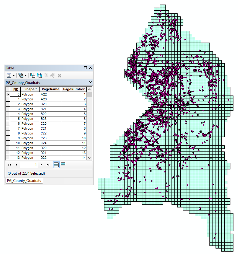
Figure 1. An implemented grid-indexed layer representing the quadrats for car accidents in Prince George’s County
Although they appear seemingly small, the calculated 789.8325m x 789.8325m quadrats total to 2,234 individual quadrats. Since this dispersion analysis is concerned with determining if the points follow a perfectly dispersed spatial pattern then the average amount of car accidents per quadrat can be calculated. After spatially joining filtered_CarAcc.shp to PrinceGeorgesCounty_Project.shp, a new layer called CarAccident_QuadratCount.shp was created. This shapefile contained a Count_ attribute for the number of car accidents failing within each quadrat. This Count_ attribute was summarized with Right-Click > Summarize… which returned a summary of points within each quadrat.
Using Microsoft Excel, an exported version of CarAccident_QuadratCount.shp was used for calculating the goodness-of-fit test. Specifically, the chi-square test was used for determining whether the car accident data was perfectly dispersed among all the quadrats. The expected value (E) of the points was represented as λ=(Total # points)/(Total # quadrats)=7643/2234=3.42. The variable O represents the observed number of points. The screenshot of the chi-squared parameters and calculations can be seen in Figure 3a (appendix). The sum of the (O-E)^2/E column represents χ^2. The degrees-of-freedom value was calculated by summarizing the Count_ attribute in CarAccident_QuadratCount.shp which was then exported into a database file called PG_CarAccident_QuadratSummary.dbf. Figure 3a indicates a total quadrat count value of 58 which makes the degrees-of-freedom value 58 -2 = 56 along with the value of χ^2=62,448.14 which was determined to be an extremely large value that corresponds with a p-value < 0.001. This allows the results to reject the null hypothesis H_0 of the car accident spatial data exhibiting a perfectly dispersed spatial pattern.
While the results dismiss the possibility of a perfectly dispersed spatial pattern there are also drawbacks to the quadrat count analysis method. The quadrat count method is actually a measure of dispersion rather than a measure of pattern because it analyses the density of points rather than their spatial positioning relative to each other. Additionally, variations within regions of the car accident data are not recognized since this analysis only returns a single value for the entire distribution. Perhaps the biggest drawback of the quadrat count analysis is how the grid size can affect the overall calculations. The grid index layer created for the car accident data in ArcMap does not perfectly encapsulate the irregular shape of Prince George’s County’s borders. Consequently, the calculations will be affected by any quadrats not within Prince George’s County. These values contribute to a larger number of quadrats recording zero accidents which affects the data’s results. The chi-square value is an extremely large which does not have a corresponding p-value found in most available chi-square test distribution tables. This can suggest that the data could may still not be perfectly dispersed with a more precise grid index layer.
Methods of determining cluster and density were used to analyze the car accident data. Among the applicable methods, Kernel-density estimation (KDE) and Mean nearest-neighbor index were used to determine density and clustering behaviors, respectively. The KDE calculated the density of car accidents in a neighborhood around those car accidents. The calculation involves dividing the number of points in a given kernel i and then divided by the total size of kernel i . In a GIS application, the parameters for calculating the Kernel density in ArcMap included the Population Field option that denotes population values for each car accident point was left with a value of NONE. The rest of the parameters were also left with their default values. Furthermore, Mean Nearest-Neighbor index was used to measure the distance between the centroid of each car accident point and its nearest neighbor’s centroid location. The value is represented as a ratio r= (d_0/(d_e ) ̅ ) ̅ where (d_0 ) ̅ represents the observed mean distance between each car accident and its neighbor and (d_e ) ̅ represents the expected mean distance for the car accidents given a random pattern.
The findings of the KDE calculations found in the Figure 2 below illustrate the density of the car accidents around each output raster cell. The density levels vary across the Prince George’s County. Dispersed points that do not have any other car accidents within a relatively close proximity do not visually appear in the cluster. The results for the average nearest-neighbor appears similar to the Kernel Density output with key differences being the proximity of the density locations. For example, the average nearest neighbor output contains smaller individual areas of density while the Kernel density output’s areas of density overlap with one another.
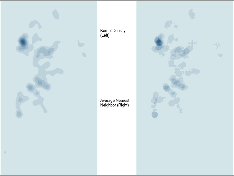
Figure 2a. Euclidean central feature (Yellow) and Manhattan central feature (Blue). The left picture is displayed with filtered_CarAcc.shp turned off for better visibility the calculated points.
Lastly, spatial autocorrelation was calculated using Moran’s I for the car accident data. Two versions of this method were used: Global Moran’s I and Anselin Local Moran’s I. The former version measures spatial autocorrelation based on the car accident locations and their Level while the latter version identifies any spatially significant spatial clusters of car accidents with high or low Level values. In essence, the local and global version of these spatial autocorrelation statistics are similar but differ in that Anselin Local Moran’s I receives its own variance, z-value along with the expected value and variance of I. Figure 4a (appendix) displays the summary for the Global Moran’s I. The p-value is high which means the null hypothesis of the car accidents being random cannot be rejected. The value I= -0.031227 indicates that the distribution of the car accidents is random. Figure 4b (appendix) also (appendix) shows the output layer for calculating the Local Moran’s I along with its corresponding attribute table. The LMiIndex attribute contains the Moran’s I value and the LMiZScore contains the z-score. The positive I value indicates that a given car accident has neighboring car accidents with similar high or low Level values. The negative values indicate a difference in Level values for neighboring car accidents.
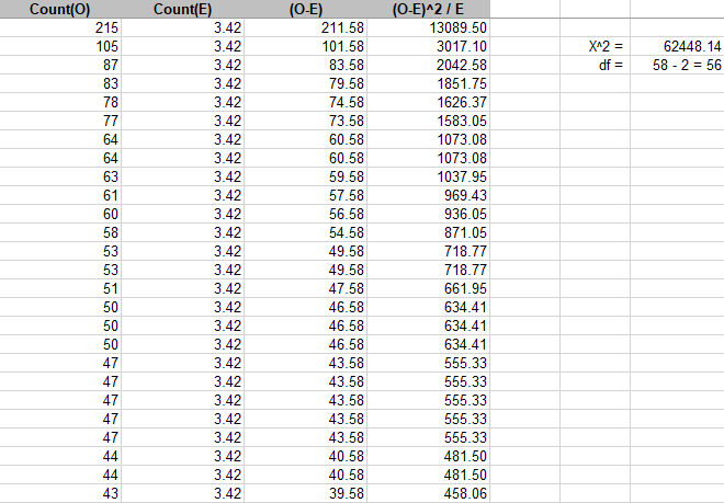
Figure 3a. The following image shows a portion of the observed quadrat counts along with their expected values

Figure 4a. Output summary for Global Moran’s I of the car accident dataset
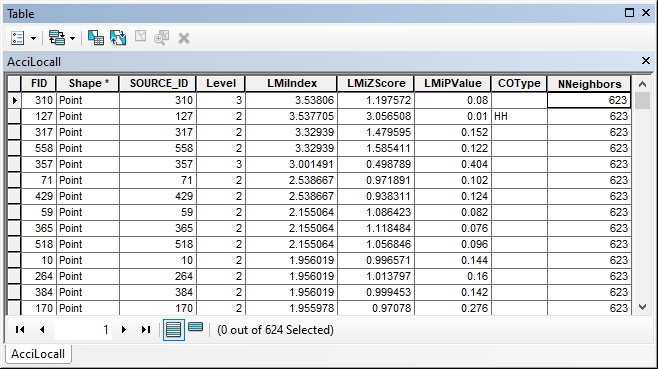
Figure 5a. Attribute table for Anselin Local Moran’s I of the car accident dataset